
Polls, websites, and was the maker of NHL.com toked when he made that layout?
Friday, August 04, 2006
I'm no da Vinci, folks. I'm far from it. That much is obvious from my trials and tribulations in hammering out an efficient, working, yet visually appealing blog when there's no news happening or I don't have my nose to the college grindstone.
But a friend of mine and I were chatting recently, and one of the things that came up was the National Hockey League's website. She's one of those people who lives her life in Photoshop, so I hear plenty enough about her adventures into web design for people's pages, and one of the recurring issues was ... well ... the fact that NHL.com looks like a 10th grader's mid-term project for his high school web design class.
Let's not just analyze the NHL's website on its own without comparison, though. Let's look at the web sites of the other three major sports in North America (no, NASCAR is not one of them).
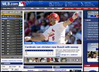 Here we have MLB.com, the home of -- you guessed it -- Major League Baseball. Here's what you can gather from just a glance over of the main page itself:
This site is packed -- packed! -- with all sorts of information on the front page alone. A full listing of daily scores on te left, drag down menus up top, a changing image and news story in the middle ... crap, do you even need other pages for this thing? It's got everything on the main page alone! Of course the drawback with this is the fact that with a lot of content comes the possibility of lag, even for DSL/Cable users. Depending on how lucky you are when loading up, you could get 1-2 flash files (the daily games list and the center image/news), or 5-6 if the advertisements are feeling sadistic. Beyond the fact that you could find out anything you ever wanted to know on the front page, the layout at least works well graphically.
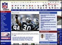
 Next up, we have every red-blooded American's favorite sport (unless you're a dirty Communist) and their website at NFL.com. Once again, you have your ever-changing main image and headline, though this one is slightly left of center instead of direct center. If you look closely enough, you can tell that the far right sidebox is overlapping the "Headlines", "Features", etc. banners a bit, which makes the whole thing seem rather cluttered. Once again the options for scores, schedules and the like are actually up top and not on the side like with the NHL's website. Notice anything else? No? Well, let's move on to the NBA's site before I point out probably one of the more obvious boons that each of the non-NHL sites share.
 If I had to pick a site which had the right combination of visual appeal with a dash of actual use to the site, it would be NBA.com's site. Now keep in mind that I loathe basketball. I would never be able to be any happier if basketball simply vanished when I woke up tomorrow morning (unless I saw the NHL average a 3.7 Nielson during regular season games ... that might be give me equal amounts of happiness).
But my dislike of the sport aside, those people at the NBA know exactly who to get to make a website. It has bells and whistles without going overboard. It manages to have an equal amount of visual aethstetics as the MLB's site without resorting to using too much, and it hardly goes overboard (I'm looking at the NFL when I say that, and their desire to put images of all 30 NFL teams up top).
Most importantly, though ... and this is the difference between the NHL's site and each of the others: They actually use the whole page!
 Look at NHL.com. What's with that huge, empty void on the right? Are they assuming that everyone is still using 800x600? There is so much room on the site that could be better used. Give us Fantasy news. Give us a streamlined and small box to check out game scores on the fly during the season. Hell, give us something beyond an abundance of advertisements at the top, bottom, and the side! I understand that every page must use advertisements, but compared to the rest ... the need for numerous banners and not just a pair of smaller ones seems ridiculous.
Well, that just about wraps up my tirade for the night. If you've read this far and kept with my broken and somewhat sporadic train of thought? Congratulations! I've actually added a poll to the bottom right of the sidebar asking all of you readers which of the four sites you prefer visually. But feel free to also choose a site depending on the main page's content as well. By all means, some other commentary on what you like or dislike about the NHL's website (or the others) would be much appreciated and welcome.
But a friend of mine and I were chatting recently, and one of the things that came up was the National Hockey League's website. She's one of those people who lives her life in Photoshop, so I hear plenty enough about her adventures into web design for people's pages, and one of the recurring issues was ... well ... the fact that NHL.com looks like a 10th grader's mid-term project for his high school web design class.
Let's not just analyze the NHL's website on its own without comparison, though. Let's look at the web sites of the other three major sports in North America (no, NASCAR is not one of them).
 Here we have MLB.com, the home of -- you guessed it -- Major League Baseball. Here's what you can gather from just a glance over of the main page itself:
This site is packed -- packed! -- with all sorts of information on the front page alone. A full listing of daily scores on te left, drag down menus up top, a changing image and news story in the middle ... crap, do you even need other pages for this thing? It's got everything on the main page alone! Of course the drawback with this is the fact that with a lot of content comes the possibility of lag, even for DSL/Cable users. Depending on how lucky you are when loading up, you could get 1-2 flash files (the daily games list and the center image/news), or 5-6 if the advertisements are feeling sadistic. Beyond the fact that you could find out anything you ever wanted to know on the front page, the layout at least works well graphically.
 Next up, we have every red-blooded American's favorite sport (unless you're a dirty Communist) and their website at NFL.com. Once again, you have your ever-changing main image and headline, though this one is slightly left of center instead of direct center. If you look closely enough, you can tell that the far right sidebox is overlapping the "Headlines", "Features", etc. banners a bit, which makes the whole thing seem rather cluttered. Once again the options for scores, schedules and the like are actually up top and not on the side like with the NHL's website. Notice anything else? No? Well, let's move on to the NBA's site before I point out probably one of the more obvious boons that each of the non-NHL sites share.
 If I had to pick a site which had the right combination of visual appeal with a dash of actual use to the site, it would be NBA.com's site. Now keep in mind that I loathe basketball. I would never be able to be any happier if basketball simply vanished when I woke up tomorrow morning (unless I saw the NHL average a 3.7 Nielson during regular season games ... that might be give me equal amounts of happiness).
But my dislike of the sport aside, those people at the NBA know exactly who to get to make a website. It has bells and whistles without going overboard. It manages to have an equal amount of visual aethstetics as the MLB's site without resorting to using too much, and it hardly goes overboard (I'm looking at the NFL when I say that, and their desire to put images of all 30 NFL teams up top).
Most importantly, though ... and this is the difference between the NHL's site and each of the others: They actually use the whole page!
 Look at NHL.com. What's with that huge, empty void on the right? Are they assuming that everyone is still using 800x600? There is so much room on the site that could be better used. Give us Fantasy news. Give us a streamlined and small box to check out game scores on the fly during the season. Hell, give us something beyond an abundance of advertisements at the top, bottom, and the side! I understand that every page must use advertisements, but compared to the rest ... the need for numerous banners and not just a pair of smaller ones seems ridiculous.
Well, that just about wraps up my tirade for the night. If you've read this far and kept with my broken and somewhat sporadic train of thought? Congratulations! I've actually added a poll to the bottom right of the sidebar asking all of you readers which of the four sites you prefer visually. But feel free to also choose a site depending on the main page's content as well. By all means, some other commentary on what you like or dislike about the NHL's website (or the others) would be much appreciated and welcome.